What happens to your money when you're gone?
Redesigning the beneficiary experience for Mercado Libre, helping millions of users designate who receives their money in case of death, with transparency, clarity, and empathy.
At a glance
- The problem: The existing beneficiary flow was built on outdated front-end and didn't meet the new design system standards
- My role: Redesign the entire experience from scratch using Mercado Libre's new design system, with no existing precedent for this type of flow
- The approach: AI-assisted exploration, emotional design for a sensitive topic, and a clear step-by-step structure
- The outcome: A transparent, human-centered flow that received positive feedback for clarity and ease of use
The context
Mercado Libre, the largest e-commerce and fintech ecosystem in Latin America, allows users to hold money in their digital wallets. But what happens to that money if the account holder dies?
The platform already had a basic beneficiary designation flow, but it was built on a legacy front-end: visually outdated, confusing to navigate, and disconnected from the design language users had come to expect from Mercado Libre.
This wasn't just a visual refresh. It was an opportunity to rethink how a fintech platform handles one of the most sensitive topics in personal finance.
How do you design for death in a product built for everyday transactions?
What was broken
The legacy experience had several critical issues:
- Built on an outdated front-end that didn't match the current platform experience
- The flow was a single long form with no progressive structure, no context, no empathy
- Users had no clear understanding of what designating a beneficiary actually meant
- No visual feedback on distribution percentages or completion progress
- The new design system had never been applied to this type of sensitive, legal-adjacent experience
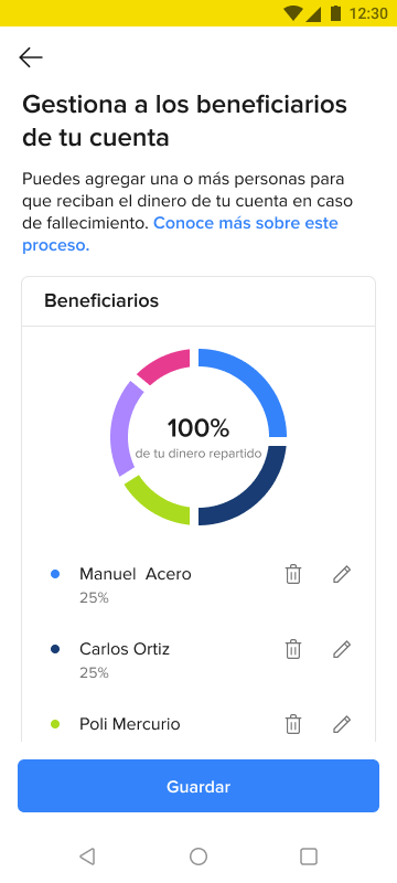
Before: Legacy Android
After: New design system
The design process
This was one of those projects where the design system gives you the components, but not the answers. No one had built an experience like this using the new system. Every decision was a first.
1. Understanding the emotional landscape
Before opening Figma, I spent time analyzing how traditional banks handle beneficiary designation. The pattern was clear: cold, legal, transactional. I wanted the opposite, a flow that acknowledges the emotional weight of the decision while keeping the process simple.
2. AI-assisted exploration
I used Claude and Gemini to rapidly explore copy alternatives for sensitive moments in the flow, testing different tones for explaining what happens to your money, how to frame the "percentage distribution" concept, and what language feels reassuring vs. alarming. I also used AI image generation tools to create contextual imagery for the onboarding screens.

The emotional entry point: warm imagery and human language instead of legal disclaimers
3. Building the new structure
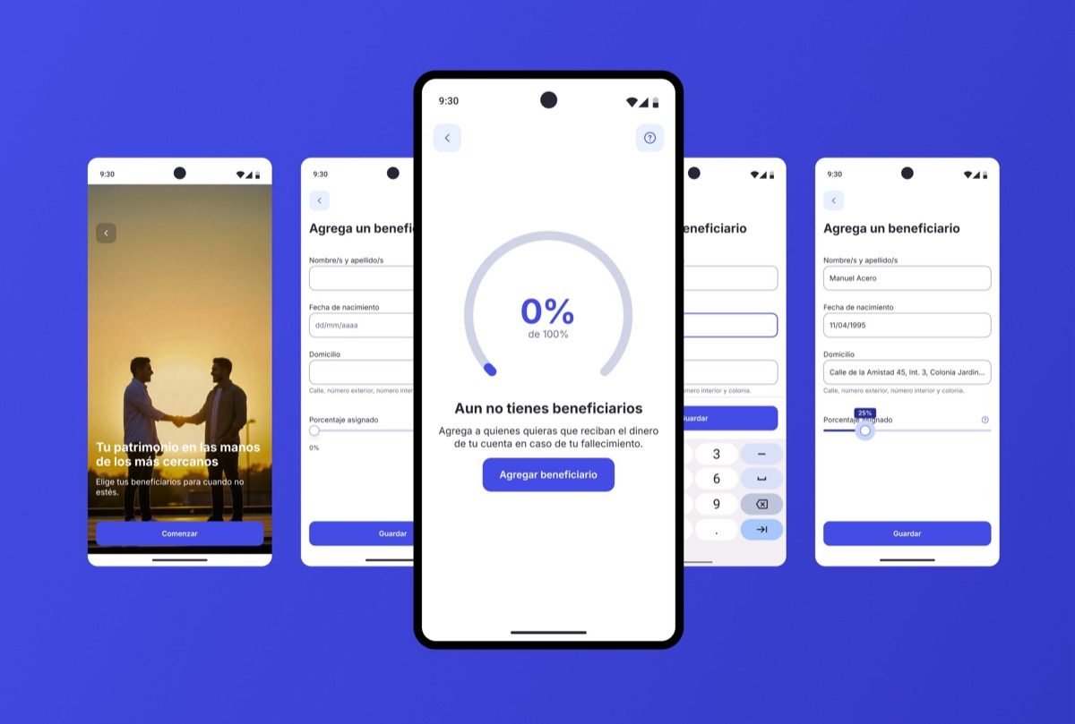
I broke the original monolithic form into three clear stages:
- Onboarding: Explain the concept with warm imagery and human language: "Tu patrimonio en las manos de los más cercanos"
- Designation: Add beneficiaries one by one with progressive disclosure, name first, then details, then percentage
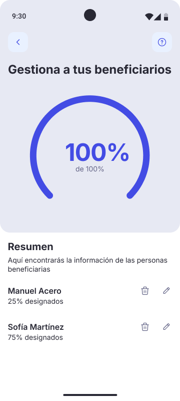
- Confirmation: Visual summary of how the money is distributed, with clear percentages and a progress ring
4. Pioneering the design system
The biggest technical challenge was adapting the new design system to a flow it was never built for. There were no existing patterns for percentage distribution UIs, progress rings tied to financial data, or onboarding screens for legally sensitive features. I had to extend the system without breaking it, creating new patterns that could be reused by other teams facing similar challenges.
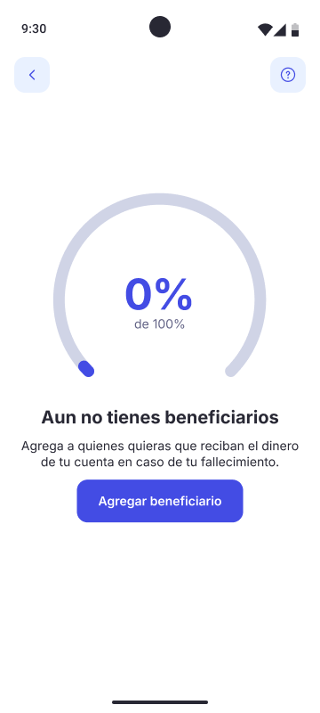
1. Empty state: 0%
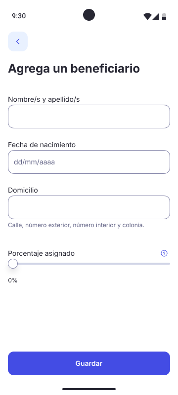
2. Add beneficiary
3. Complete: 100%
Step 1: Entry point
Warm, human imagery sets the emotional tone from the start.
Step 2: Empty state
The progress ring at 0% creates a visual goal that motivates completion.
Step 3: Add beneficiary
Progressive disclosure: only essential fields visible, reducing cognitive load.
Step 4: Complete
100% distributed. A clear summary with edit and delete options for each beneficiary.
Comparison: Legacy version
The same feature on the old system: cluttered, outdated, no emotional design.
Use arrows or keyboard ← → to navigate
The solution
The final experience transforms a legal requirement into a moment of care. Instead of filling out a form, users go through a guided journey that respects the sensitivity of the topic:
- Entry point: Warm, human imagery with reassuring copy, not a legal disclaimer
- Empty state: A progress ring at 0% creates a visual goal, making the abstract concept of "distributing your money" feel tangible and achievable
- Progressive forms: Information is collected in stages, not all at once, reducing cognitive load on what is already an emotionally heavy task
- Real-time feedback: The progress ring updates as beneficiaries are added, giving users a clear sense of completion
- Transparency: Every step explains what information is needed and why, building trust in a moment that requires it
Outcome & feedback
The redesigned flow was implemented for both Android and iOS. While I don't have access to post-launch quantitative metrics, the qualitative feedback was consistently positive:
- Stakeholders highlighted the transparency and clarity of the step-by-step structure
- The design system team recognized the new patterns as reusable foundations for other sensitive flows
- The emotional tone, warm instead of cold and human instead of legal, was cited as a differentiator from how competitors handle the same feature
What I learned
Design systems don't have all the answers. When you're building something the system wasn't designed for, you have to think like a system designer yourself, creating patterns that solve your problem and serve the broader ecosystem.
AI is a thinking partner, not a shortcut. Using Claude and Gemini for copy exploration didn't replace my judgment; it expanded my options. I could test 20 different ways to say "what happens when you die" in minutes, then choose the one that felt most human.
Sensitive topics demand design bravery. The easy path was to keep it transactional: a form, a legal checkbox, done. The harder path was to acknowledge that we're asking someone to think about their own death. That acknowledgment, expressed through warm imagery, progressive disclosure, and careful language, is what makes the experience feel different.